Creative insights: reworking The Mortgage Works
Marianne interviews Creative Director Ali and Senior Designer David about our recent rebranding project for The Mortgage Works.
Q. Tell me a bit about the background to the project?
Over the last 10 years, the intermediary-facing buy to let market has grown dramatically: with the available Buy to Let products increasing from 145 to around 2,100 and active lenders increasing from 2 to over 40 – all battling for brand salience. During that period, Nationwide Building Society’s B2B specialist lender, The Mortgage Works, has consistently been one of the top two providers.
The Mortgage Works has been at the forefront of buy to let for nearly three decades, providing an evolving range of products available primarily via mortgage intermediaries. What’s more, in an ongoing brand salience study by research company BVA BDRC, The Mortgage Works’ brand communications have also consistently outperformed the competition, with some of the highest scores ever recorded for brand recall and ‘unprompted willingness to recommend’. But in an ever-growing market – with an increasing number of new players chasing market share – they can’t afford to sit still.
Recognising this, and rather than rest on their laurels, The Mortgage Works took the strategic decision to re-evaluate their brand and ask themselves some key questions; are we clear what we stand for? Is it compelling, different, and authentic? Are we reflecting who we are, what we do, and why we do it, as well as we possibly could?

Q. What was the aim of the project?
The Mortgage Works were aware that over the years they had lost some clarity around what they stood for and recognised the opportunity to build on their existing position of strength by addressing this. Our challenge was to revisit The Mortgage Works story, define their proposition, and ensure this was being brought to life as effectively as possible through their brand identity.
Q. What was the biggest challenge?
Ali: Trying to improve on something that already works. The Mortgage Works has been at the forefront of the broker-facing buy to let space for many years, both in terms of market share and the effectiveness of its marketing and communications. All credit to the team at The Mortgage Works for rejecting complacency and being prepared to question something already so strong. Our challenge was to move ‘very good’ to ‘great’ and be prepared to throw out everything we know works in the process. That’s never easy.
David: With any financial services branding refresh project, there’s always an element of “how far is too far?”. What this project allowed us to do was to explore taking the brand beyond evolution, and venture into a revolution of the original look and feel. This is always the trickiest part, as it begins to flag up a lot of questions around whether this is right for the brand. At every stage, we tried to answer these questions, and remove ourselves from the fact that we’d worked on the existing brand for many years.
Q. Tell me a bit more about the creative process and how we got to the final design?
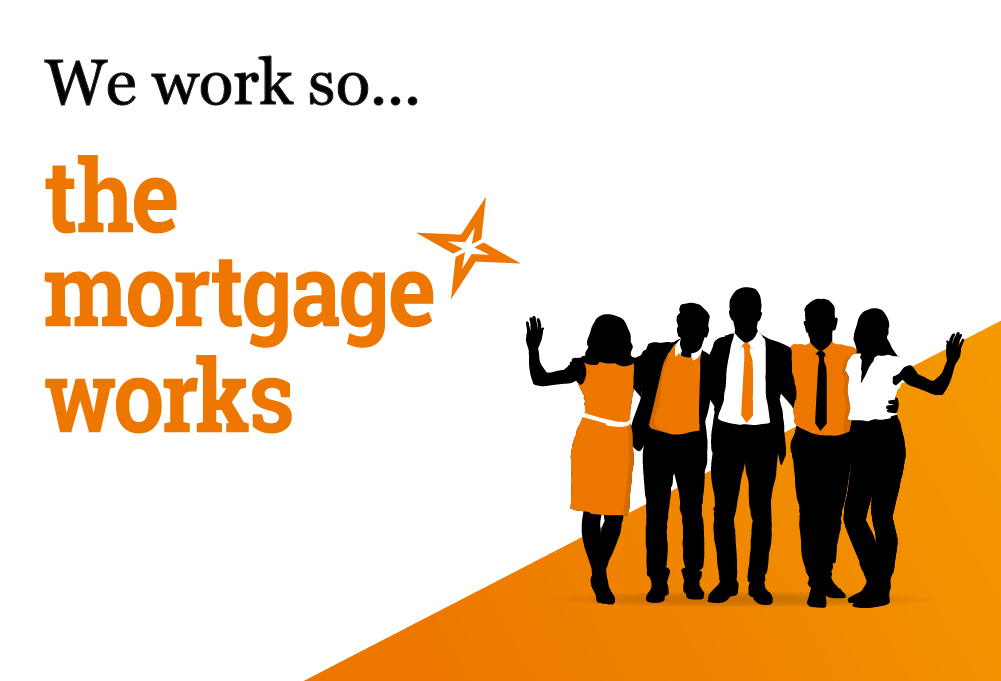
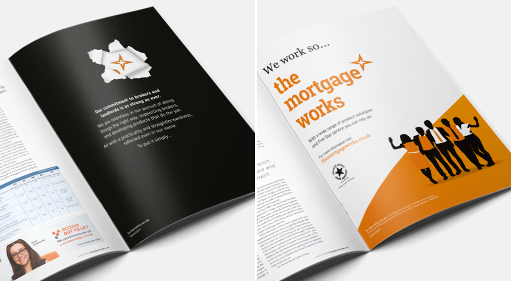
The solution lay in a simple insight. The specialist mortgage space – and more recently buy to let – is renown for lenders coming and going. From day one, The Mortgage Works has consistently delivered in a dependable, straightforward manner with a touch of humanity. Grounded in a desire to support brokers and landlords alike, this approach remains as compelling, relevant, and distinctive today as it always has. This direction of thought led us to the line “We work so The Mortgage Works”. With personality and simplicity, it captures what The Mortgage Works is all about – an enduring commitment to brokers, a common sense approach to products, five-star service – and sits at the heart of their story. Armed with that clarity, we were in a position to objectively evaluate their brand expression.
In terms of visual identity, we considered a number of routes, from evolution to revolution. We explored the idea of potentially moving on from the figures, a key identity asset, and using photography instead. However, to stand out and retain scope for playfulness, the upshot was to keep the figures but revitalise them for a new era. Previously, the figures had represented only members of The Mortgage Works team. With some refinements and a little more detail, the figures now represent a more diverse mix of people – landlords, tenants, brokers. The refreshed visual direction also makes greater use of white space and includes ‘The Flash’: a new asset that sets the stage for the figures. Collectively, the new creative elements and how they work together is a nod to the concept of a brighter future, a key message of the wider Nationwide brand.

Q. What was the most enjoyable aspect of this project?
Ali: To say the ‘journey’ is a cliche, but in this case it’s true. We were forced to think really hard about what makes The Mortgage Works so special and find a way to articulate that so it truly resonates with all stakeholders. All the ingredients were there, we just needed to revisit the recipe. That process, and having the space to do it, was the most enjoyable aspect for me. Aside from working with Mark, Gareth, and the rest of The Mortgage Works team of course!
David: For me, the most enjoyable bit about branding projects is always the end; this isn’t because the project is over, but because it’s just the beginning… We’ve built the foundations (foundations that will hopefully last as long as the original), and now I can’t wait to bring the brand to life further.

Q. How do you feel about the final result?
Ali: Genuinely delighted. The Mortgage Works is particularly close to our hearts. We created the original brand over ten years ago and have played an ongoing role in making the business the success it is today. We’re proud guardians. The rebrand work lands more towards evolution than revolution, but every aspect of the brand and identity has been improved. The story is clearer, more compelling, and better told. And the refreshed identity brings all that to life with renewed energy and vitality.
David: I’m really happy to see where we’ve got to – not only in the look and feel but in the whole positioning of The Mortgage Works. The response from the Nationwide team has been great.
“We’ve taken a well-known and established brand, and refreshed it with a compelling story and contemporary look and feel. We’ve been really impressed with the level of thought, consideration, and detail mark-making* have gone into. It’s given us a lot of confidence in ensuring The Mortgage Works is well prepared for the future.”
– Gareth Thomas, Marketing Manager
About markmaking*
markmaking*