
The Mortgage Works
Reinforcing a market leader position
Brand refresh builds from a position of strength, clarifying what The Mortgage Works stands for, revitalising its distinctive assets, and reinforcing its position as the sector leader.
The challenge
The Mortgage Works has been at the forefront of buy-to-let for nearly three decades, providing an evolving range of products. In an ongoing study by research company BVA BDRC, The Mortgage Works’ brand communications have consistently outperformed the competition, with some of the highest scores ever recorded for brand recall and ‘unprompted willingness to recommend’. But, with an increasing number of new players chasing market share, the specialist lender can’t afford to sit still.
The Mortgage Works recognised it had lost some clarity around what the business stood for and saw the opportunity to build on its existing financial services branding position of strength by addressing this. Our challenge was to revisit The Mortgage Works story, define its positioning, and ensure this was being brought to life in as compelling a manner as possible.


The solution
The solution lay in a simple insight. The specialist mortgage space, and more recently buy-to-let, is renown for lenders coming and going. From day one, The Mortgage Works has consistently delivered, in a dependable and straightforward manner, with a touch of humanity.
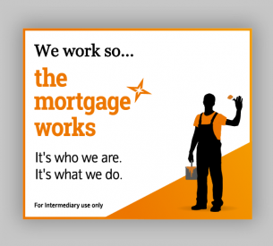
Grounded in a desire to support brokers and landlords alike, this approach remains as compelling, relevant, and differentiated today as it always has. This direction of thought led us to the line “We work so The Mortgage Works”.
With personality and simplicity, it captures the essence of The Mortgage Works – an enduring commitment to brokers, a common sense approach, and five-star service – and sits at the heart of the brand story. Armed with that clarity, we were in a position to objectively evaluate how the brand was expressed.


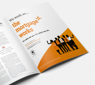
In terms of visual identity, we considered a number of routes, from evolution to revolution. We explored the idea of potentially moving on from the figures, a key visual identity element, and using photography instead. However, recognising the value of the figures as a distinctive asset, integral to recall and brand association, we chose to retain them, with a touch of revitalision for a new era.
Previously, the figures had represented only members of The Mortgage Works team. With some refinements, the figures now represent a more diverse mix of people – landlords, tenants, brokers.
The refreshed visual direction also makes greater use of other distinctive assets, built over nearly two decades. Specifically, the use of white space and the instantly identifiable orange colour. A new asset, ‘The Flash’, has also been introduced, a device designed to set the stage for the figures. Collectively, the new and revitalised creative elements, and how they work together is a nod to the concept of a brighter future, a key message of the wider Nationwide brand.

The results
The revitalised branding, that both communicates a differentiated positioning, and builds on the success of its distinctiveness, has been rolled out internally and externally across multiple channels. Early effectiveness indicators are extremely positive with The Mortgage Works seeing a steady uplift in marketing recall and brand salience.
In the most recent BVA BDRC research report (Project Mercury), The Mortgage Works achieved an all time high (for any lender) with 87% ‘Unprompted Willingness to Recommend’, firmly cementing the brand’s position as the undisputed number one buy-to-let lender in the UK.
Gareth Thomas Marketing Communications Manager, Nationwide Building SocietyWe’ve taken a well-known and established brand, and refreshed it with a compelling story and contemporary look and feel. It’s given us a lot of confidence in ensuring The Mortgage Works is well prepared for the future.
Sara Bennison Chief Product & Marketing Officer, Nationwide Building SocietyClear and exactly where it should be with a mixture of brashness, elegance and simplicity! A glorious piece of branding.