Preservica
Positioning for new markets
Rebrand and website repositions market-leader in digital information asset preservation to break into new markets.
The challenge
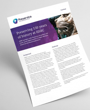
Digital preservation is a hot topic and an industry in which Preservica is already a trusted name, with clients including BT, HSBC, The National Archives, MoMA, and the European Commission.
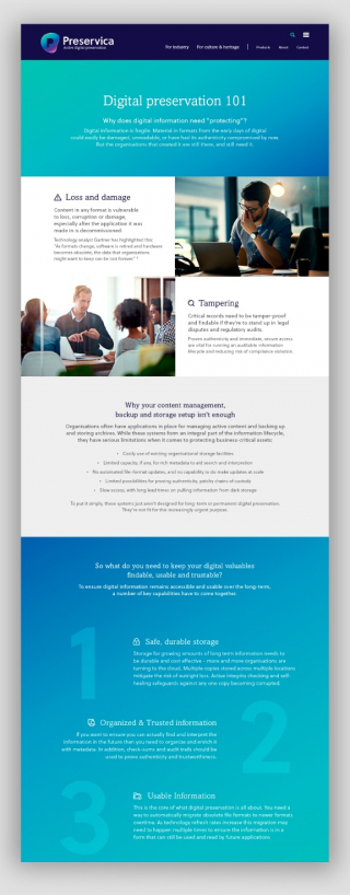
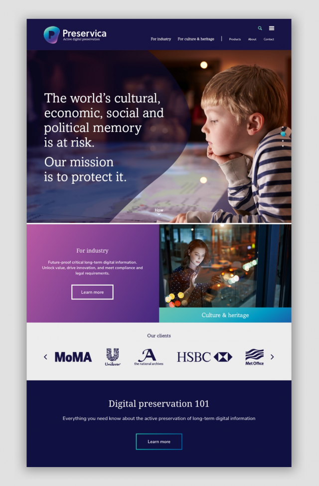
Preservica’s active digital preservation platform safeguards and ensures access to digital information over decades. With a reputation predominantly in the culture and heritage space, where digital preservation needs little explanation or motivation, Preservica’s significant growth ambitions means cracking an altogether different market – industry.
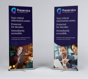
Our challenge was to define a positioning and create an identity that would resonate with a corporate audience,without alienating existing clients, and in turn drive sales.

The solution
File-format migration is Preservica’s key differentiator. In essence, their unique software platform enables the active migration of digital information assets to newer file format versions and entirely new file formats.
This gets around the issues of no longer supported versions and format obsolescence, meaning original assets are secure (their integrity unaffected) and accessible over the long-term. In effect, it is a ‘living archive’ and this inspired the identity direction.
Mike Quinn CEO, Preservicamark-making* provided just the right level of brand-advisory and web-development we were looking for. Everyone we have met at mark-making* has been excellent, and our internal marketing team have enjoyed working with them. Definitely a productive partnership.
The results
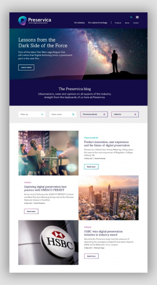
Early indicators and anecdotal feedback point to the new identity and website performing exceptionally well, effectively articulating a more focused and compelling message to new and existing market sectors alike.
The dynamic marque at its heart is comprised of two elements; a fluid outer shape, reflecting the active nature of the file format, and at its core a fixed ‘P’ shape, representing the information asset itself – permanent, authentic, secure and trustworthy.
Two colours represent Preservica’s two main markets – culture and heritage, and industry and business. And the blend between them is a further nod to the fluid, dynamic nature of Preservica’s system.