We started by listening. Desk research combined with employee surveys, stakeholder interviews, workshops, and direct conversations with the brokers and savers who know Harpenden best – a depth of discovery that’s rare for a mutual of this scale, and exactly where the most robust strategies come from.
What we found was a brand truth hiding in plain sight. Harpenden’s real differentiator isn’t its products or its rates – it’s a feeling it leaves people with that comes from clarity, care and dependability. Brokers need it to place complex cases. Savers need it to plan their futures. Colleagues need it to do their best work.
From there, we developed a full brand framework – positioning statement, tailored value propositions for savers and intermediaries, a values architecture, and authentic personality traits: Wise, Interested, Can-do, Playful. Credible and action-oriented, but human and memorable too.
The strategic territory this pointed to was clear: heritage reimagined. Seventy years of trust and substance, to be externally expressed with the clarity and distinctiveness the Society had never quite managed before.
The creative idea
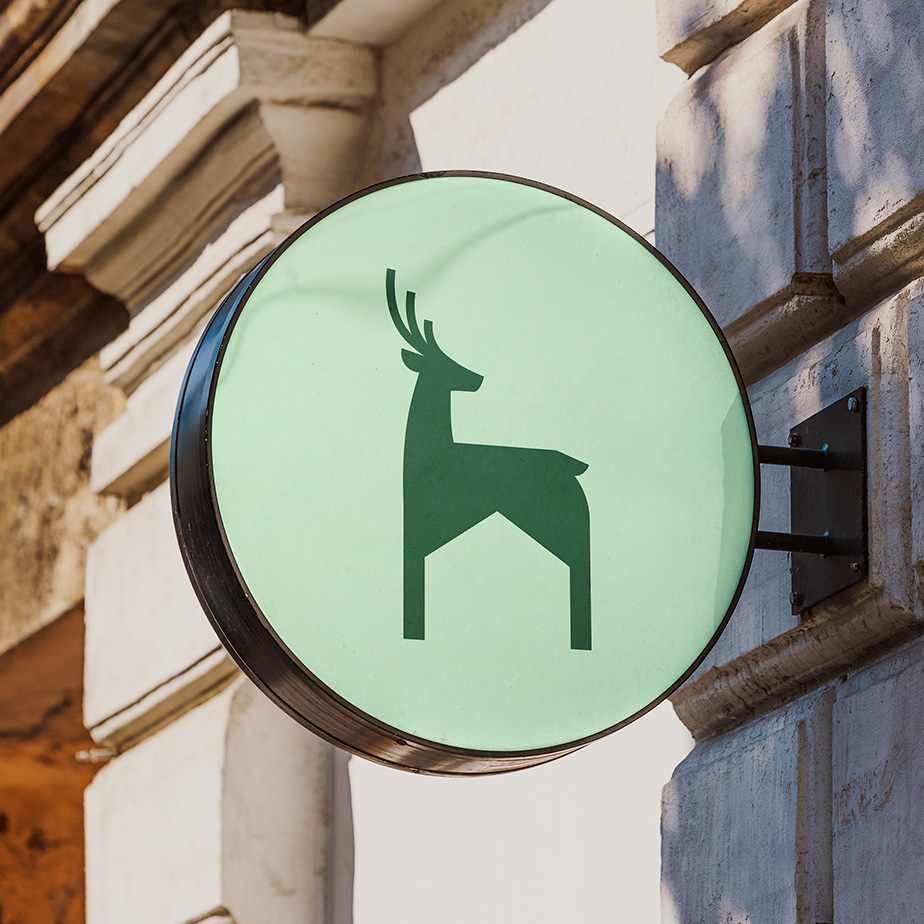
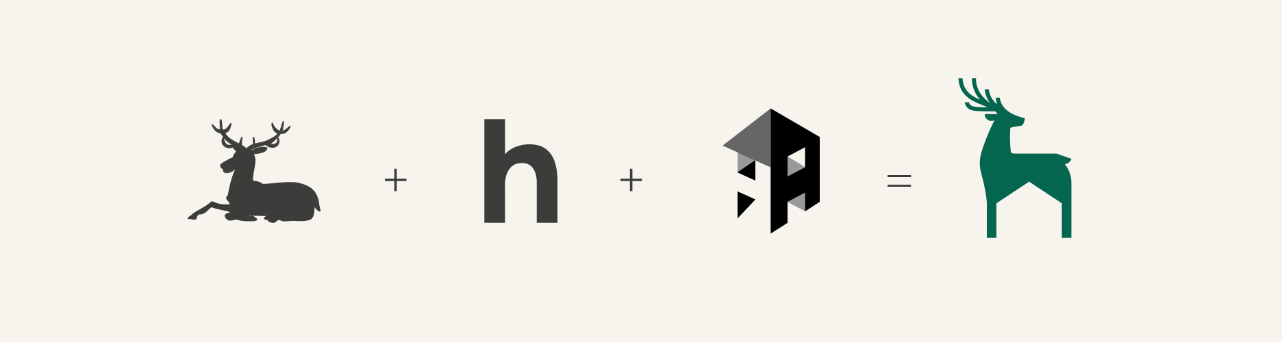
The original marque was a stylised H and house shape – functional, but devoid of character. In its place, a newly created hart (male deer), rooted in the Society’s own sense of place. Harts have appeared on the heraldry and flags of both the town of Harpenden and the county of Hertfordshire for centuries. This needed to be the hart of Harpenden Building Society, unique and distinctive.
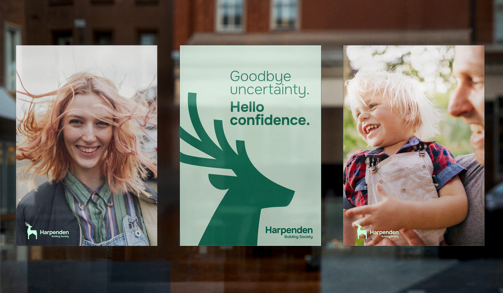
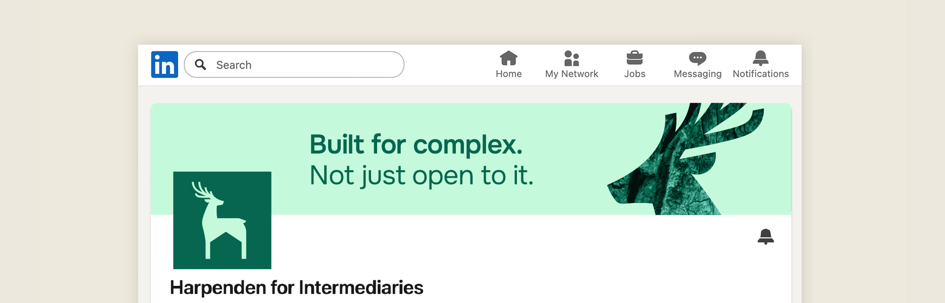
The hart stands in a position that nods to the letter H, and the negative space between his legs forms a house shape – a subtle echo of the previous logo and the Society’s role as a home for members, savers and brokers alike. As a symbol, the hart also carries the right associations for the brand: confidence, wisdom, dependability. Built from bold, distinctive graphic shapes – a considered mix of curves and angles – the hart extends beyond the logo into a wider icon system, and is used to host messaging across photography and communications.
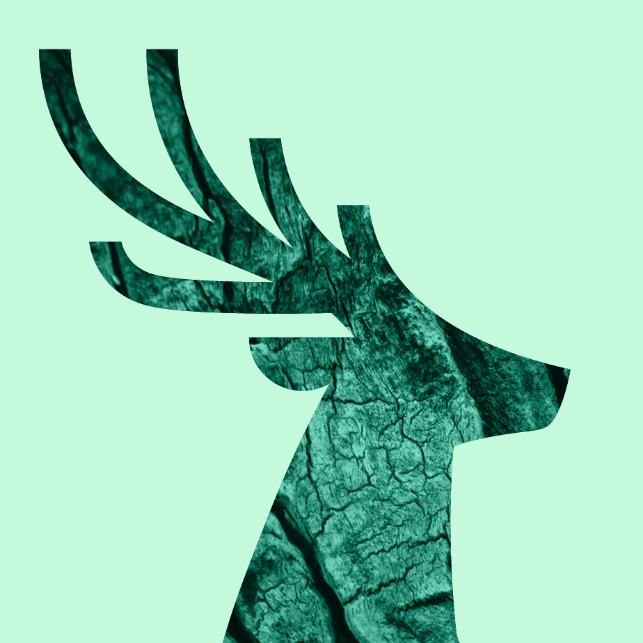
The sense of place runs through the rest of the identity too. The colour palette and tactile textures are both drawn from the hart’s natural habitat – woodland greens named after the Hertfordshire landscape (Hawthorn, Heather, Blackberry, Fern), paired with close-up textures of leaves, bark, moss and water, tinted to feel distinctly Harpenden. The purposely accessible Onest typeface completes an identity that is meaningful, memorable, and unmistakably rooted in its origins.
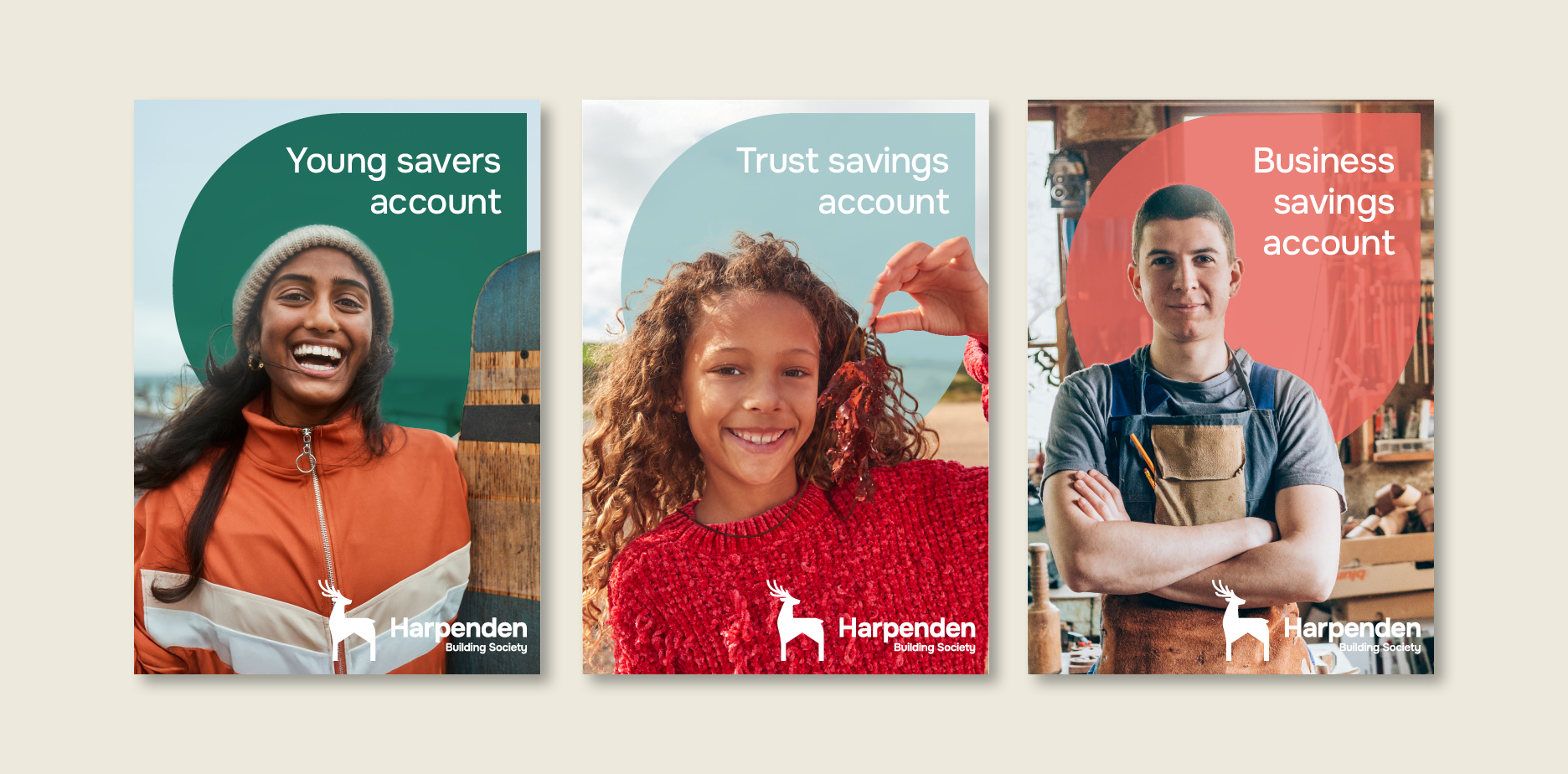
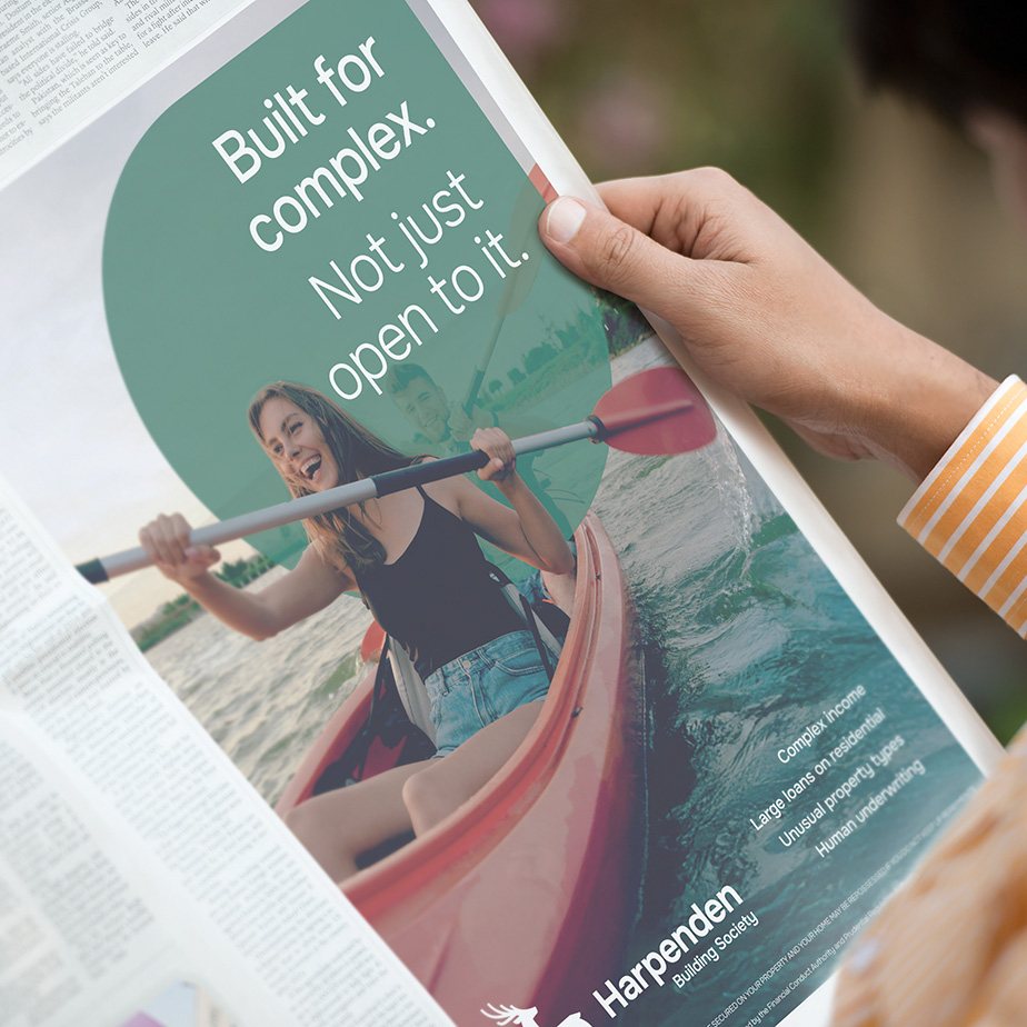
Photography was treated with the same rigour. Rather than generic stock imagery, a bespoke approach was developed to capture confidence in five real-life contexts – at home, at work, at play, in nature, and in character – to ensure the brand promise is visible and not just stated.
The rollout model was designed with equal care. mark-making* led the strategy and identity, then equipped the internal team and an existing design partner with comprehensive brand guidelines to carry the work forward. This was a deliberate consultancy-without-dependency approach that delivered maximum value, recognising that for a mutual like Harpenden every pound of investment is a pound of member money.
Going further still, we developed a bespoke brand tracking framework and implementation guide alongside the identity. This was designed specifically for a compact marketing team with limited resources. Built across three pillars (perceptual, behavioural, and internal indicators), it gives Harpenden a practical, fit-for-purpose system for demonstrating board-level return on brand investment.