Brand identity and integrated campaign for Greenredeem
Greenredeem was formed in August 2011 and is a recycling reward scheme aimed at improving the capture rates of beverage containers when consumers are away from home. It works by using a deposit scheme centred around an interactive kiosk where plastic bottles and cans may be deposited in return for reward points redeemable with participating reward partners.
Greenredeem acquired the UK division of Recyclebank, a global leader in providing rewards for recycling programmes formed in the US, in April 2013. As part of the acquisition Recyclebank needed to be rebranded under the name of Greenredeem. This presented two key challenges.
Firstly, it was important that the new identity minimised the risk of alienating the large and established customer base of Recyclebank (UK), whilst at the same time better reflected the brand in terms of proposition, values, and essence. Secondly, whilst Greenredeem and Recyclebank operated in broadly the same field with a similar proposition, they were still essentially two different operations with different values and personalities. Before we could develop an appropriate and effective identity we would first need to define the new brand.
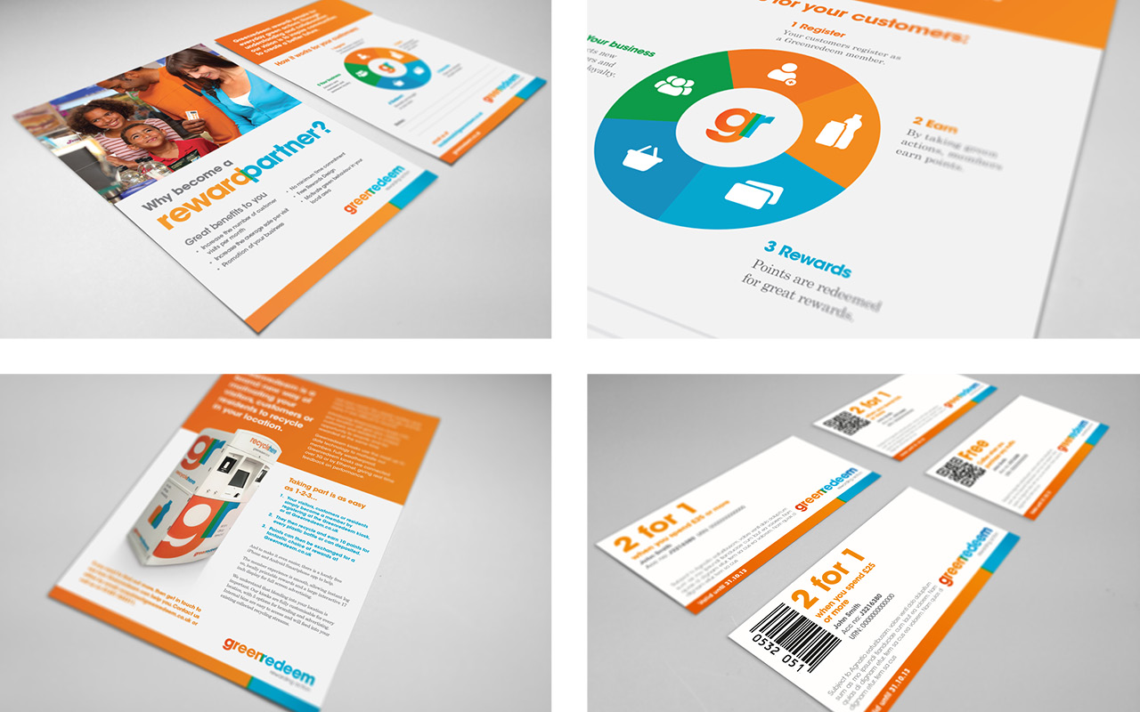
The brand identity development included core assets (logotype and strapline), broader design language, brand identity guidelines, print collateral, kiosk graphics and digital communications. The logotype itself was inspired by the creation of the colour green through the mixing of blue and orange. The use of blue was a nod to Greenredeem’s heritage as Recyclebank.