![]()

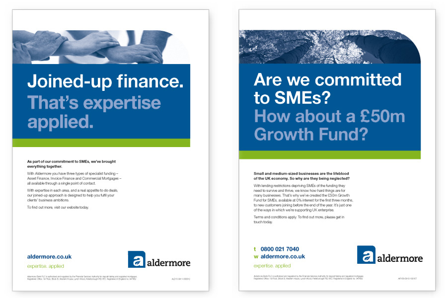
As the first UK bank to be launched since the credit-crunch, Aldermore provides specialist lending services to small and medium-sized UK businesses and flexible savings accounts to UK savers. Aldermore does not depend on the wholesale, securitisation or international capital markets and is one of the most strongly capitalised banks in the UK.
Nine months after launching, with the business growing fast and new divisions joining the group, it was appropriate to take a step back and evaluate the original brand identity.
Through a process of interviews and workshops, involving a broad cross section of the business, we were able to get under the skin of the organisation and really understand its ‘DNA’.
Armed with this understanding, and the findings from an audit of competitors’ identities, we had the basis for objectively evaluating the existing brand identity.
The conclusions, with respect to developing the brand identity pointed towards ‘evolution’, with elements of ‘revolution’ as opposed to a total design overhaul. All building on the strong work already done.
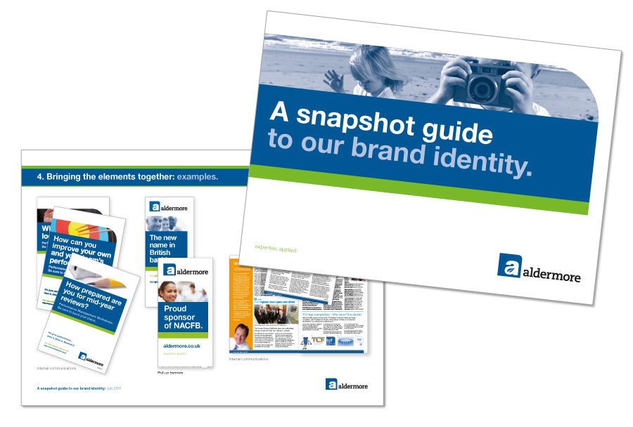
In practice this meant developing some of the key identity assets, leaving others untouched and introducing some new elements. For example, the logo was rebalanced, the colour palette rationalised, a strapline created, layout elements introduced and practical guidelines introduced for copy and tone of voice.
The result is a flexible, yet distinctive and immediately recognisable brand identity that better communicates the essence of Aldermore.