Spitsbergen retraced: a journey through time and ice
Background: an Arctic expedition
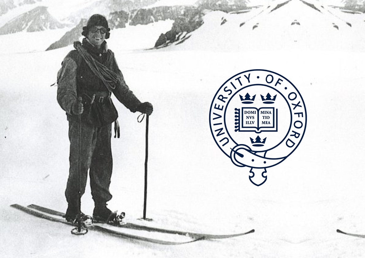
Earlier this year we were approached by five undergraduates from Oxford University, who were planning a rather extraordinary expedition. Late this summer, they will retrace the route travelled by another undergrad group, which left Oxford for the Arctic Circle in 1923. Their destination? The island of Spitsbergen in the remote Svalbard archipelago.
The team plan to compare both the methodology and the findings of the two expeditions, even down to the style of documentary: recreating 1920s photographs and diaries with 2010s technology. A film will tell the story of the two polar ventures, once the second gets safely home.
The 2016 expedition will build scientific insight of the region, documenting the changes wrought on the landscape over the last century. Working closely with researchers from the University of Oxford and University Centre in Svalbard, the team will collect data and samples to help build a picture of the remote environment and of glacial change in the Arctic region.
So… why did they come to us?
Challenge: a sense of identity
The team approached us asking initially for a bit of help with the branding work they’d done so far – and it was a great starting point. We decided we could help them best by solidifying and formalising the work they had begun.
With a clearer identity acting as a sort of statement of intent, the venture and its outcomes become attractive to corporate sponsors. We hoped this approach would also make it easier to generate public interest.
The result: research and output
As ever, we began at the beginning, with what turned out to be fascinating research into records from the original 1923 expedition, and insights into the current team’s preparation.
Name
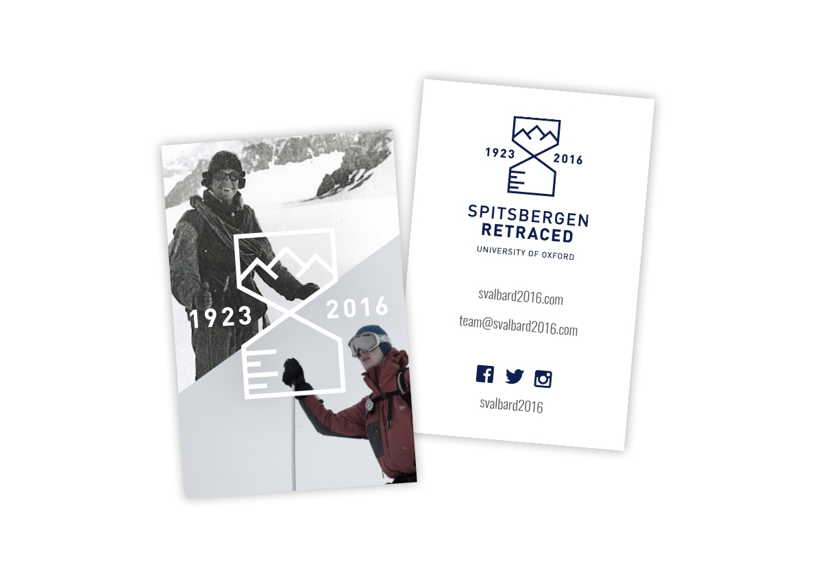
We proposed choosing a short moniker, something easy to remember that would capture the essence of the expedition. ‘Spitsbergen Retraced’ is just that; it works in the location, and represents the historic narrative of their expedition.
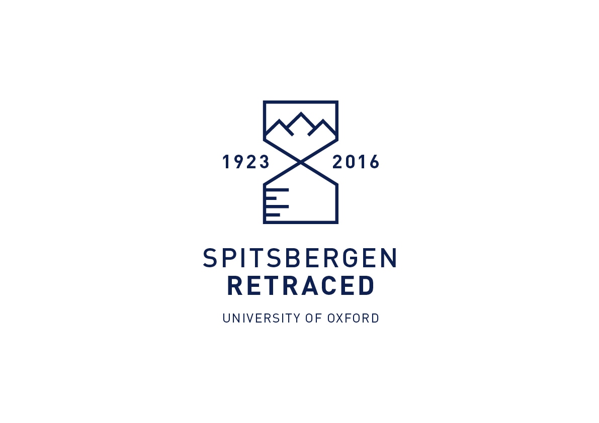
Marque
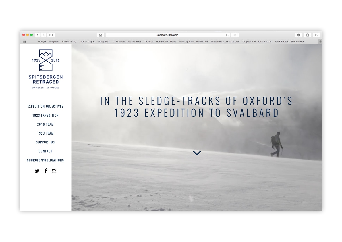
The logo was developed to represent the multifaceted nature of the excursion. The marque, featuring an hourglass with mountains in the upper bulb and beaker markings in the lower one, articulates the integrated concepts of time, geography and science that underpin the trip.
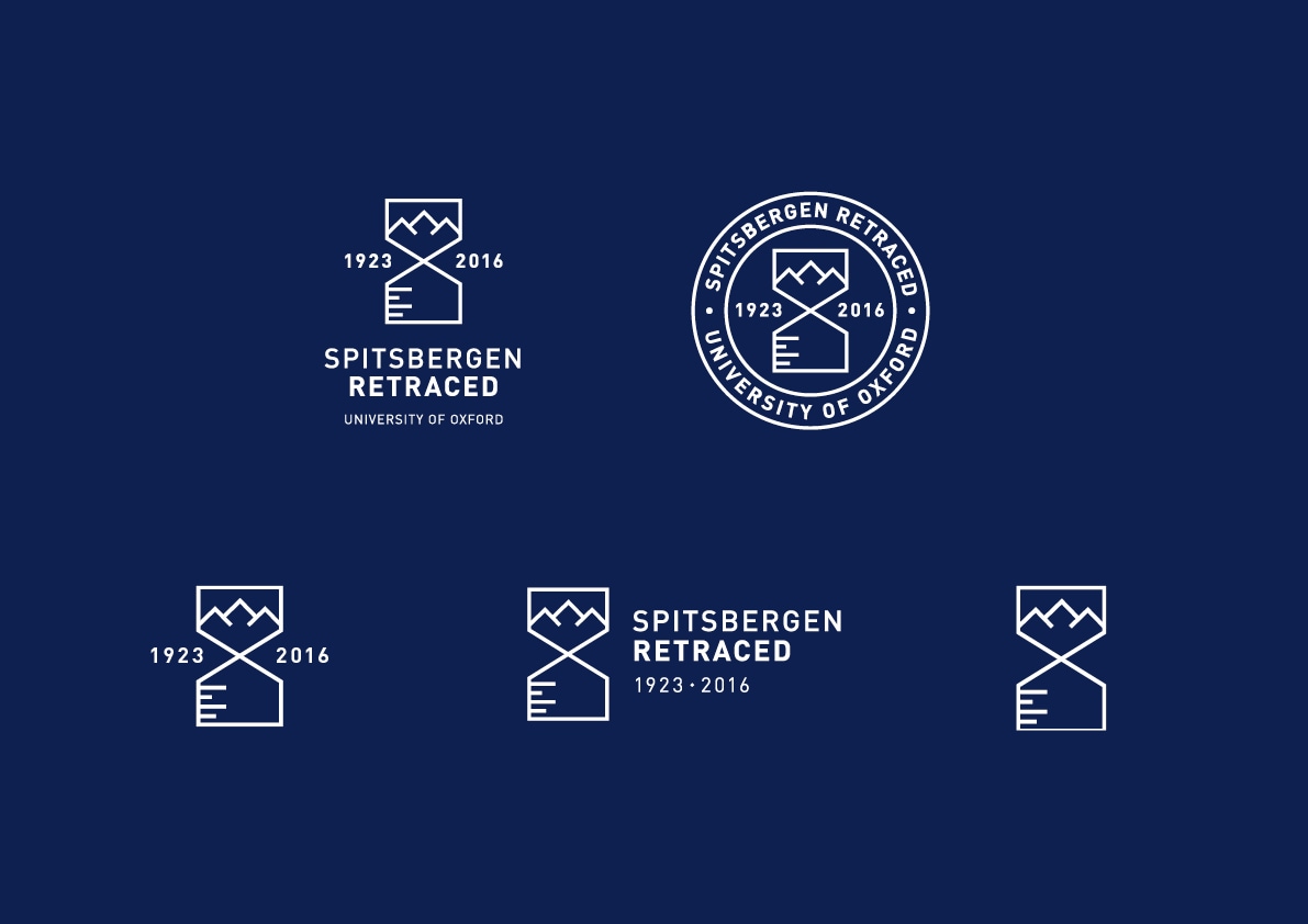
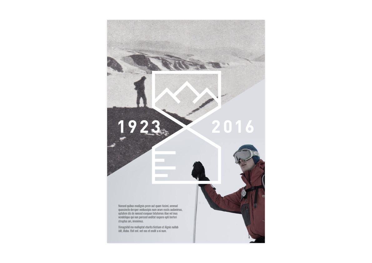
Design language
We adopted the angles of the hourglass to offer an aesthetic scheme for print collateral, presentations and social media content. This provides a perfect template for visual contrasts between 1923 and 2016 photography.
What’s next?
Later this summer, the team will be heading forth to spend 30 days on the ice (brr!). In the meantime, they are training in earnest and have released a fantastic expedition trailer:
Check out their website, Facebook, Twitter and Instagram for updates on their progress. We can’t wait to hear all about it and watch their documentary when they get back.
Safe travels boys!
About Megan
Megan Williams
Senior Designer