Look at me! The importance of vital visual branding in social media
 Want to take your social media to the next level? Make it visual! The well known secret of visual social branding lies in consistent elements like colours, fonts and designs. These assets are commonly used by successful companies who have long since learned how to grab our attention with the power of visuals.
To help you experiment and have fun with designs (especially if you are not a designer!) we have planned series of blog posts which will help you explore the role of visual branding. You will discover mobile apps and some really handy online tools along the way. Let’s start off with some basics, and the way visual content influences and inspires our decisions.
The effect of visual branding
Whether we like them or or not, on social media pictures are worth thousands of words. Here are some stats to confirm this..
- Almost half of our brain is involved in consuming and processing visuals. Brain research revealed that we can make sense of a visual 60,000 times faster than text in less than 1/10 of a second.
- 92.6% of people make their buying decisions based on the visual factor.
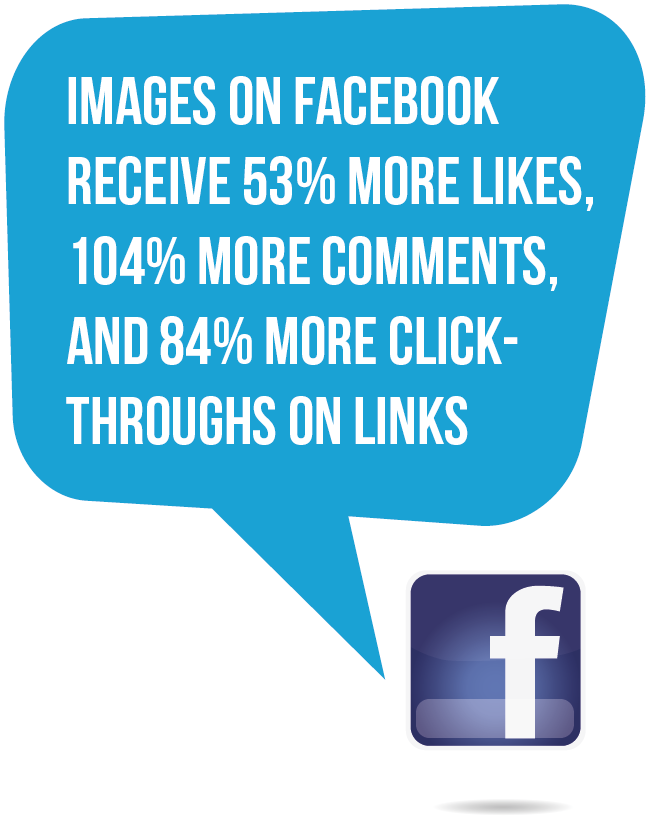
- Images on Facebook receive 53% more Likes, 104% more comments, and 84% more click-throughs on links (Kissmetrics)
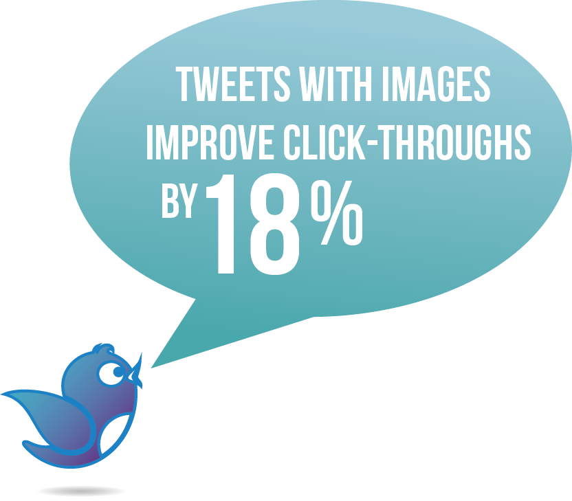
- Using images on Twitter improves the number of retweets by 150% and click-throughs by 18% (Buffer)
- Images are even good for PR. According to PRNewswire, images added in a press release can expand the reach by 180%.
With Twitter’s new redesign, Facebook testing new profiles, and Pinterest jumping on GIFs, the importance of visual engagement has never been stronger.
As readers get tired of words, images not only grab our attention but also evoke emotions while selling the core message. Visual designs plays a vital role in marketing and advertising as they build relationships and improve brand familiarity.
The way your content looks is how your community perceives you. Good visual content can:
- Improve your social media
- Make your more memorable
- Help people recognise your brand
- Help you connect with your community
- Effectively communicate your products, promotions, events or hashtags
- Send traffic to your website
- Encourage sharing and engagement
Never forget. Images make you memorable.
Before you start thinking of improving your visual branding identity, approach messaging more holistically.
Don’t just post, treat updating your social media accounts as way of connecting with your customers and prospects.
Also, don’t forget that everything you create can be reused and shared somewhere else, on your blog, services page, email or even on a flyer. When creating graphics for social media….
Set your colour palette
Start off by looking at your brand’s personality and the colours which have been used so far. Choosing the right palette will help you to be recognised. If you are a newbie it will help to attract attention.
TIP: A strong palette is the key to brand recognition. Find out how colours affect customers purchase with this infographic.
Determine fonts
Another solution for improving your branding visual identity is by adding action words on top of your photos or graphics. Some words like verbs can induce a stronger call-to-action. To fully draw attention to your graphics choose between 1 and 3 fonts which you are going to use. Using these same fonts will help you train your audience to recognise your updates in their newsfeed. This also can increase interaction and encourage clicks.
TIP: Keep your graphics simple, less is better than more as too much text may distract, causing your message to get lost.
Have a ‘theme’ for all your visuals
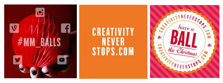
If you are planning to launch a new campaign which will last longer than few weeks, it might be worth creating a theme which will hold together its structure. This will help your updates to become more memorable while helping you to establish the campaign. We have tested this approach many times while running our competitions and social media campaigns. The best example which shows basic elements of visual branding working together was captured during our festive campaign ‘Have a ball this Christmas with mark-making*’. The main colours of the campaign – bright pink, orange, red – helped our social broadcast stand out within users’ feeds, while the hashtag #mm_balls and website link became consistent elements, encouraging participation while also becoming a visible calls-to-actions.
Create consistent templates
Templates are a useful way of maintaining consistency between specific updates, like promotions or competitions. They can also allow anyone within your social team to easily create visual messages when they are most needed. Reusable templates save a lot of time! TIP: Create a branded background template saved as PNG file, which you can use to overlay by adding photos, products, names of events or hashtags. You can include your brand’s colour, font, the date, a title or even a logo.
Action plan, these few suggestions will help you put the above ideas into practice:
- Set your colour palette
- Use consistent colours
- Pick between 1 to 3 fonts to represent your brand
- Always use high resolution images
- Choose the right image dimensions for different social channels
- Don’t forget to add watermarks or logos
- Don’t be selfish, always credit the source if you are sharing images which are not yours
- Test, repeat and… learn! In the next blog post from the series of vital visual branding we will discuss the available online resources which help you edit, create and download beautiful images.
By Kasia Piekut
About markmaking*
markmaking*
mark-making* is an award-winning creative agency specialising in branding, campaigns and communications