Simplicity = success
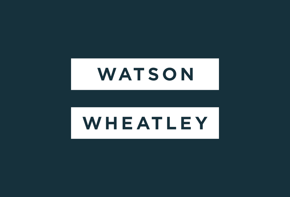
Watson Wheatley is a family-run business specialising in reconciliation software and support for the financial services industry. They came to us earlier in the year, recognising that their existing financial services branding and website, while functional, didn’t differentiate their offering effectively in a competitive industry.
Through interviews and other research we got to grips with the fundamentals of their product and services, and more significantly, with the personality, approach and drivers that truly distinguish them in their field. Armed with this knowledge, we developed a compelling, authentic and flexible identity. It supports and promotes Watson Wheatley as they continue to build the business and their customer base.
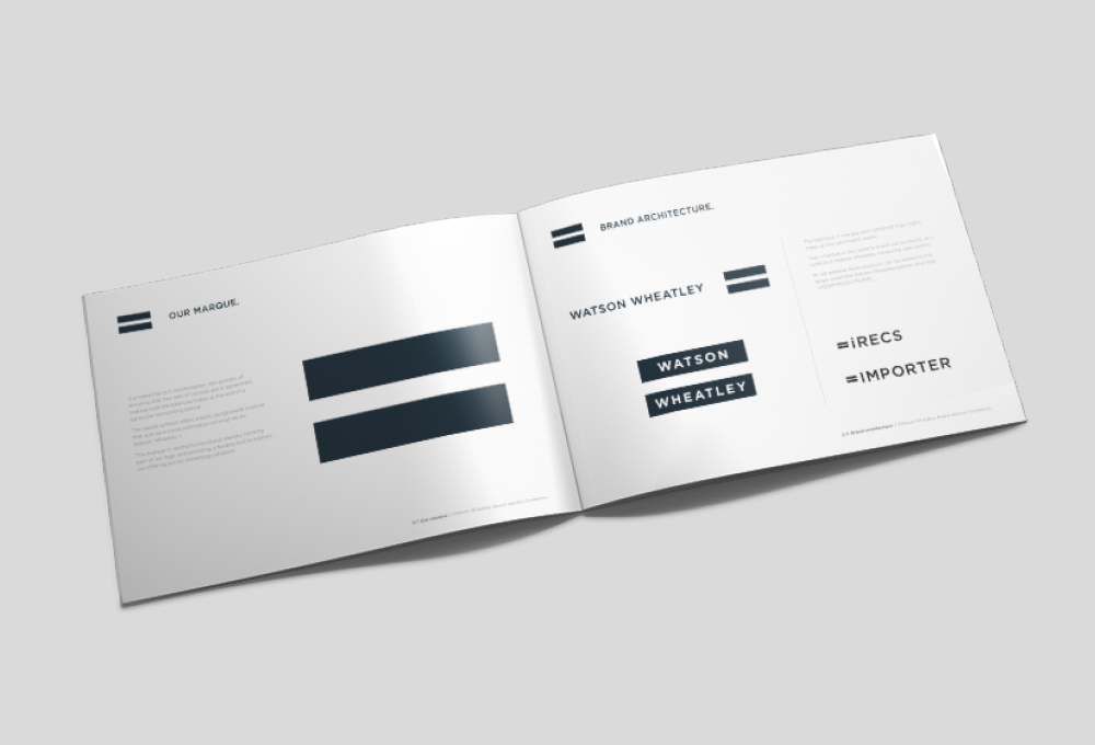
= A meaningful marque
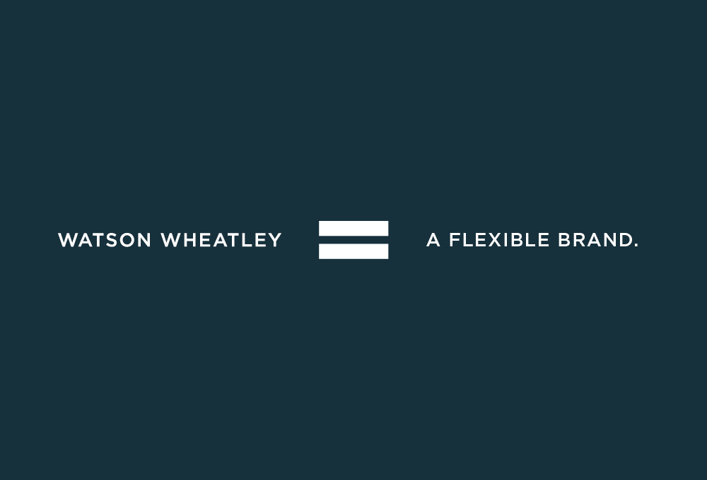
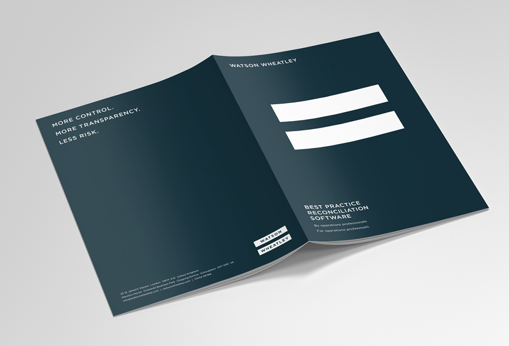
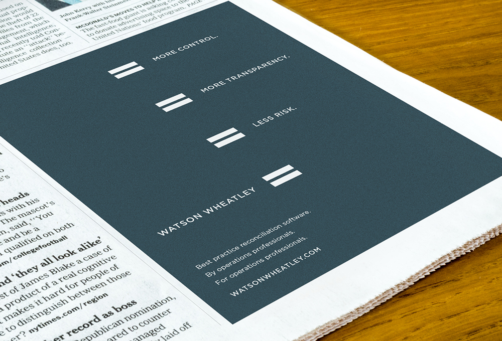
Watson Wheatley’s niche is in reconciliation: the process of ensuring that two sets of records agree: making sure the balances match at the end of a particular accounting period. Their products take incredibly complex financial data and process it at speed according to each client’s very specific requirements. With this in mind, we adopted an equals symbol. It’s a bold, recognisable marque that acts as a visual summation of what they do: Watson Wheatley =
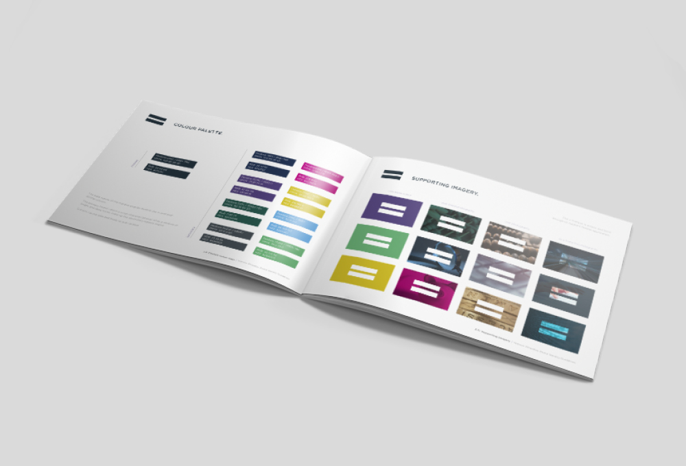
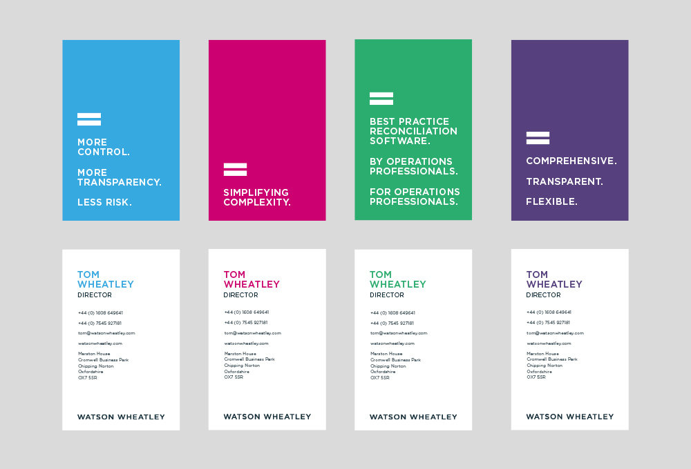
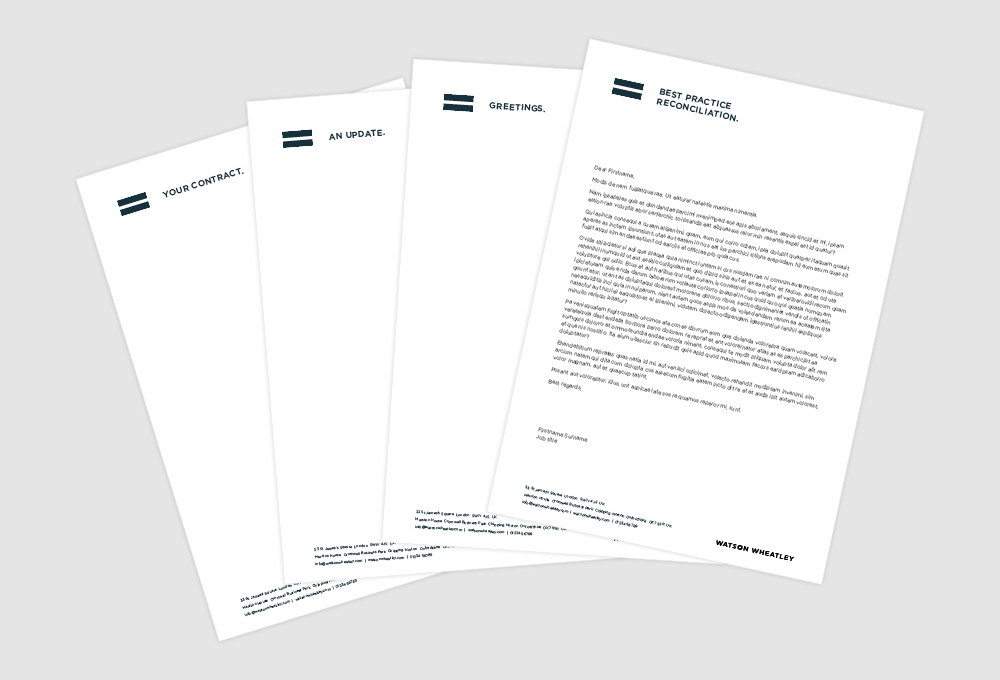
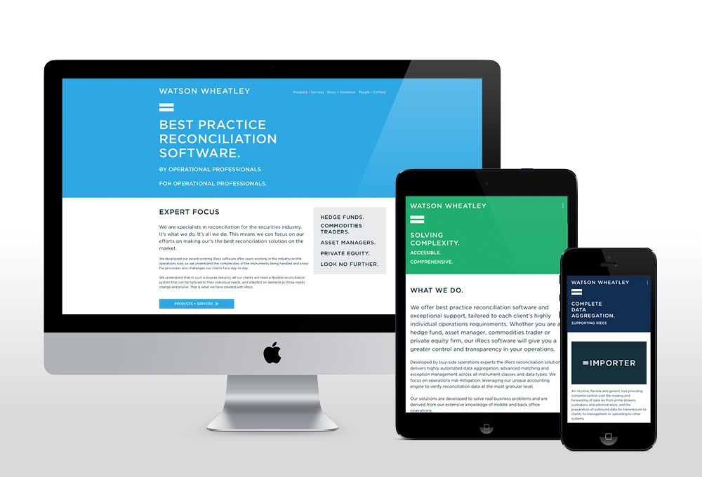
This marque is central to the new brand identity. It forms part of the logo and provides a flexible device that communicates the offering in marketing collateral. The simplicity of the marque allows for creative application of supporting imagery and a bold colour palette, giving their communications real stand-out. Combining the = marque with short, meaningful statements offers a simple and striking mechanism for brand messaging across print and digital communications.
= Simple, clear communication
Part of our challenge was to make sure that the core of their offering – drawing a straightforward output from complex inputs – came across in their messaging and tone.
The original website was complicated – rich in detail but sometimes jargonistic or repetitive – with content spread over many pages in a multi-tiered structure. After a process of distilling, simplifying and restructuring, the site not only reflects the new aesthetic but offers customers clear navigation to more straightforward content.
Our new identity is a step change from what we had before and has been well received by clients and prospects alike.
We found the mark-making* process very thorough and it really made us think about how we are perceived and how we get across the company values.
We are really proud of the final product and would certainly recommend the mark-making* team
Tom Wheatley, COO, Watson Wheatley
About markmaking*
markmaking*
mark-making* is an award-winning creative agency specialising in branding, campaigns and communications