A living brand for the living archive
To the untrained eye, communicating what Preservica offers isn’t straightforward. When they first approached us about a branding and communications project, we had to immerse ourselves in the world of digital preservation.
The new website will explain it clearly, but here are the highlights as gleaned by the team.
- Digital formats are fragile – they don’t last as long as we imagine they do because they can get corrupted, or the software you need to read them can fall out of use. Plus, they’re no use in dark storage where there’s a long lead time to get access.
- This is why basic data backup isn’t enough for organisations that need to keep any files for more than 10 years (which is about 98% of organisations).
- With the trio of durable storage, automatic migrating of files into the latest format, and – crucially – easy accessibility when documents are needed, Preservica’s software rises to this challenge.
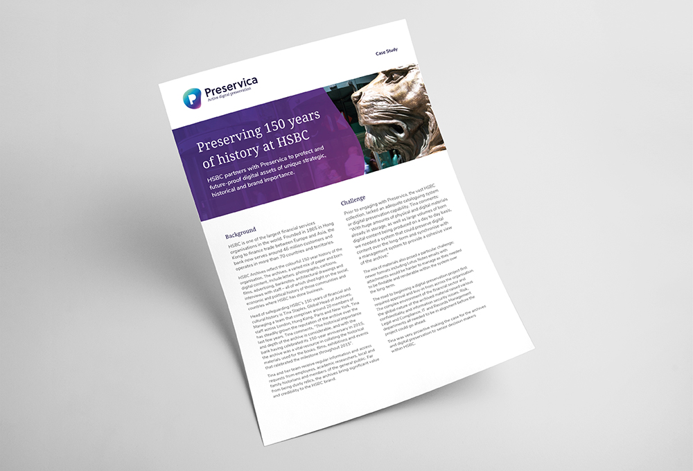
Preservica’s product allows organisations in industry, and culture and heritage, to create active, living archives – for the likes of Unilever, HSBC, MoMA and Yale University Library. They are powerful tools which help businesses fully leverage their digital collections, meet their compliance obligations and build legal defences, and share information to make doing business easier.
Our challenge was to express that in an identity, layered with a strong track record, a firmly customer-focussed approach and a history of shaping the digital preservation industry itself. Simple.
One identity, many shapes
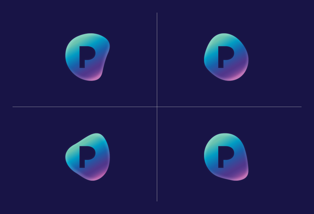
We played with lots of ideas around transformation, and old and new. Ultimately, it was file-format migration* – one of Preservica’s key differentiators – that inspired the new look at feel. At the heart of the new identity is a dynamic marque. A suite of interchangeable shapes comprises the outer element, reflecting the fluid and active nature of the file format. At their core sits a constant ‘P’ shape, representing the information asset itself – fixed, authentic, secure and trustworthy.
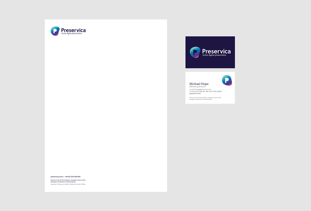
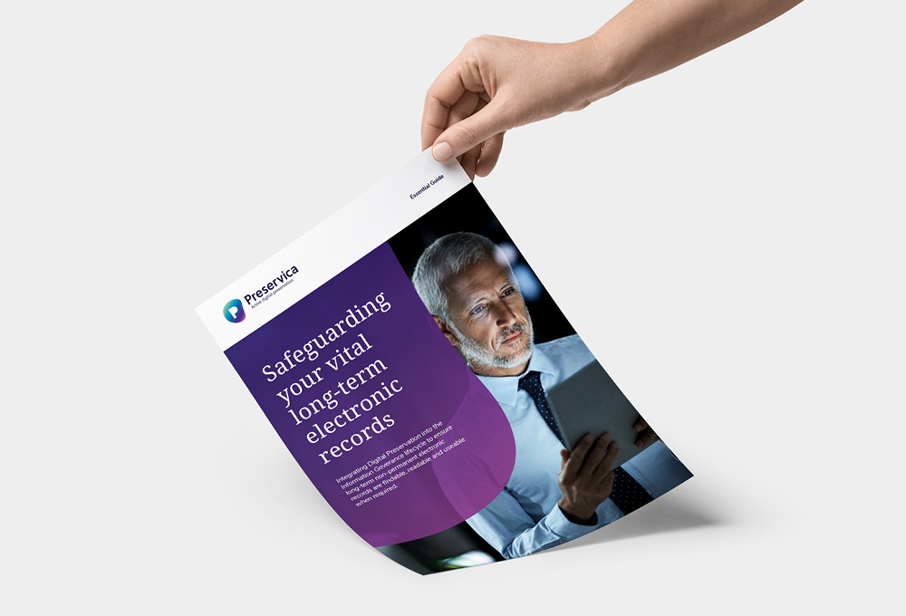
Two colours represent Preservica’s two main markets – culture and heritage, and industry and business. And the blend between them is a further nod to the fluid, dynamic nature of Preservica’s system. The shapes took on a life of their own in image overlays, crops and buttons.
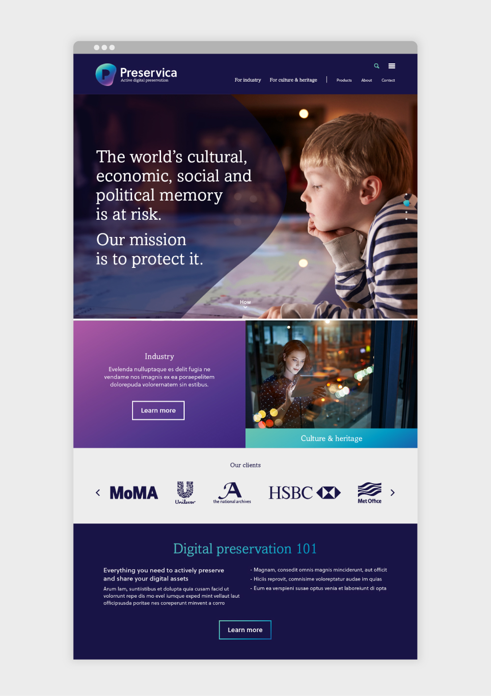
The start of a new online journey
Preservica.com has gone live this week! We’re looking forward to seeing the first batch of analytics once the site has had a chance to settle in.
*Roughly: Files are automatically translated to newer/more current formats over time so they remain useable and readable for decades
mark-making* provided just the right level of brand-advisory and web-development we were looking for. Everyone we have met at mark-making* has been excellent, and our internal marketing team have enjoyed working with them. Definitely a productive partnership.
Mike Quinn, CEO, Preservica
About markmaking*
markmaking*
mark-making* is an award-winning creative agency specialising in branding, campaigns and communications